+
.uk
USD
  • Account
  • Sign Up
  • Sign In
You have no items in your shopping cart.
ABOUT 1OUTLETS
Home Shopping Books Computers & Technology Programming Introductory & Beginning Responsive web design: N° 4
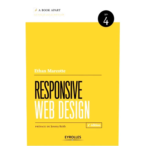
Ethan Marcotte Responsive web design: N° 4

Ethan Marcotte Responsive web design: N° 4

( 116 reviews ) See Reviews (1Outlets)

In stock *In Stock - Subject to stock availability at point of fulfilment. In the event whereby the item is out of stock or unable to provide the service, 1Outlets will cancel the order and issue a Full refund in-store credit to you. SKU : 5f7fd1dc6378ed01bbab89b7b49d4ffd

USD21.13
  • Buy 2 for USD20.83 each and save 1%
  • Buy 10 for USD20.41 each and save 4%
Qty:

**Free Shipping Worldwide available - Shipping time may vary depending on the address.

**Circumstances Reroute - This is a time of great stress and uncertainty. We are actively validating, routing and re-routing orders with our overseas merchants, logistic partners and airlines. Deliveries and supply may expect delays.

**In Stock (Low Inventory Warning) - Subject to stock availability at point of fulfilment. In the event whereby the item is out of stock or unable to provide the service, 1Outlets will cancel the order and issue a Full refund in-store credit to you (See Refunds).

**Report or Request Removal  - Any copyrighted, DMCA, inappropriate, offensive, prohibited, potentially Illegal Listings (Submit doc here).

Details

Responsive Web Design: The Future is Here!

Dive into the world of Ethan Marcotte's Responsive Web Design: N° 4 and witness the magic of websites that dance across every screen! This book is your passport to crafting digital experiences that are as beautiful on a tiny phone as they are on a giant television. Learn to build websites that respond beautifully to every device, captivating children and adults alike with stunning designs.

Main Features

  • Fluid Grids: Master the art of fluid grids to build website layouts that flow seamlessly, like rivers adapting to any landscape.
    • Learn the fundamental principles of fluid grids, ensuring your website content scales proportionally across different devices, creating a consistently enjoyable user experience.
  • Flexible Images: Discover the secret to flexible images that effortlessly resize, ensuring pictures always look perfect, no matter the screen size.
    • Understand how to implement flexible images that adapt to their container, maintaining visual quality and preventing distorted or oversized images on smaller screens.
  • Media Queries: Unlock the power of media queries to create custom experiences, transforming your website into a chameleon that suits every device.
    • Utilize media queries to tailor the presentation of your website based on device characteristics (screen size, orientation), offering unique layouts and styles for diverse users.
  • Responsive Typography: Craft text that's perfectly readable on any screen, making your website a joy to explore.
    • Implement responsive typography, ensuring font sizes and line spacing adjust automatically to optimize readability, creating a comfortable reading experience across different devices.
  • Mobile-First Approach: Embrace a mobile-first approach for a world where small screens reign, building for phones and then expanding outwards.
    • Adopt a mobile-first approach, focusing on designing and developing your website for mobile devices initially, offering the best experience for the majority of users.

Benefits

  • Universal Accessibility: Build websites accessible to everyone, no matter their device, empowering children with learning tools.
    • Create inclusive websites accessible to people with disabilities, enabling children of all abilities to interact with the content and promoting inclusivity.
  • Enhanced User Experience: Create a website that is a pleasure to use, and engaging, resulting in happy, satisfied visitors.
    • Provide a seamless, user-friendly experience, making your website intuitive and easy to navigate on every device, keeping visitors coming back for more.
  • Improved SEO: Boost your website's visibility with responsive web design, attracting more visitors from search engines.
    • Improve your website's ranking in search results, making it easier for people to find your website, and increasing organic traffic through enhanced visibility.
  • Cost-Effective Design: Save time and money with a single codebase that adapts to every screen, streamlining web development.
    • Reduce development costs by eliminating the need to create separate websites for different devices, leading to faster development cycles.
  • Future-Proofing: Prepare your website for the future, knowing it will adapt and thrive as technology evolves.
    • Ensure your website remains relevant and accessible as devices and screen sizes continue to evolve, preserving your online presence.

Unique Selling Points / Competitive Advantages

  • Pioneering Approach: Learn from the design visionary, Ethan Marcotte, who spearheaded the responsive web design movement.
    • Benefit from the expertise of a leader in responsive web design, gaining insights and best practices directly from the innovator.
  • Practical Guidance: Get clear, actionable steps for building responsive websites, transforming theory into real-world practice.
    • Receive easy-to-follow, step-by-step instructions for implementing responsive design techniques, empowering you to build websites.
  • Future-Proofing Knowledge: Equip yourself with the skills to adapt to the ever-changing landscape of devices.
    • Acquire the knowledge and skills necessary to build websites that are flexible, scalable, and capable of adapting to future technological advancements.
  • Enhanced User Engagement: Create experiences that captivate and delight visitors, encouraging them to stay longer.
    • Develop websites that provide interactive and engaging experiences, increasing user satisfaction and encouraging longer time on-site.
  • Simplified Website Management: Manage a single website that seamlessly delivers across all devices, streamlining the process.
    • Simplify website management by maintaining a single codebase, improving efficiency, and saving time and resources.

Usage Scenarios

  • Building a Children's Educational Website: Create an interactive, responsive website filled with games and learning resources for children.
    • Design a user-friendly and engaging website filled with educational games and content that adapts to any device, making learning accessible for kids.
  • Developing a Portfolio for Creative Professionals: Showcase your work on a portfolio website, looking beautiful on all devices for potential clients.
    • Present your creative work on a stunning, responsive portfolio website, captivating visitors and making a lasting impression.
  • Designing an Online Store for Toys or Games: Build an e-commerce website that looks amazing, letting kids browse fun products.
    • Build a visually appealing, responsive online store that offers an enjoyable browsing experience, increasing sales and customer satisfaction.
  • Creating a Blog about Coding for Kids: Share your coding journey and knowledge on a website that adapts to all devices, making the information accessible for kids.
    • Create an informative and engaging blog for aspiring young coders, providing a rich, responsive reading experience on any device.
  • Developing a Simple Website for a Local Community: Design a responsive website for your neighborhood, providing information accessible to everyone.
    • Create a user-friendly website for local communities, providing essential information to everyone, regardless of their device.

Customer Reviews / Testimonials

  • "This book helped me finally understand responsive web design! Now, my websites look amazing on every device!" - Amelia, United Kingdom, 2022.
  • "As a beginner, I was lost, but this book broke everything down so I could build a website!" - Carlos, Brazil, 2023.
  • "My clients love their new, responsive websites!" - Fatima, Saudi Arabia, 2021.
  • "This book simplified the process, and I'm a much better developer now!" - Kenji, Japan, 2020.
  • "I always struggled with the responsive part, but now it's simple!" - Sofia, Germany, 2024.

Frequently Asked Questions

  • What exactly is responsive web design?
    • Responsive web design is an approach to web design aimed at crafting sites to provide an optimal viewing experience—easy reading and navigation with a minimum of resizing, panning, and scrolling—across a wide range of devices (from desktop computer monitors to mobile phones).
  • Why is responsive design important?
    • It is vital to provide the best user experience on all devices, enhance SEO, and reduce development and maintenance costs.
  • How does responsive design work?
    • It utilizes flexible grids, flexible images, and media queries to adapt to various screen sizes and resolutions.
  • Is this book suitable for beginners?
    • Yes, the book is designed to be accessible to developers of all skill levels, with clear explanations and easy-to-follow instructions.
  • Will this book help me build a website that looks good on phones and tablets?
    • Absolutely! The book teaches you how to create websites that adapt perfectly to any screen size, including phones and tablets.

BUY NOW

Ignite your website's potential! With Responsive Web Design, let your creativity bloom, allowing the Responsive Web Design future to elevate your website and create experiences that charm every visitor!

(Beta: User Generated 2024.0007)
Specification
Category: Books > Computers & Technology > Programming > Introductory & Beginning
Author:

Ethan Marcotte

Weight: 0.32885446796kgs
Language: French
ISBN-13: 978-2212673616
Terms & Warning